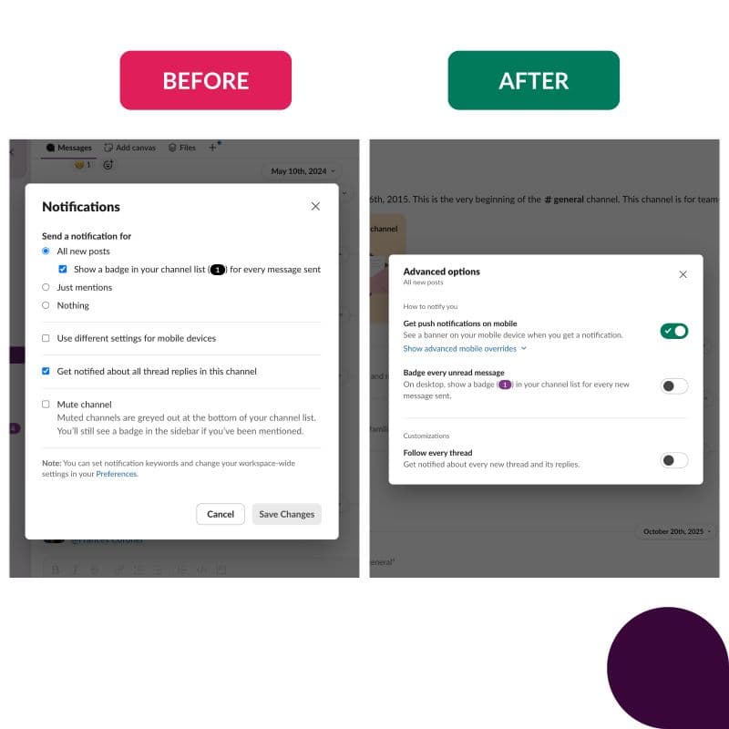
Shipping Slack's Sidebar Indentation 💅🏽
Shipped sidebar improvements to Slack including channel indentation, smart breakpoints, consistent padding, and default section icons — a thoughtful glow-up that improves usability without disrupting familiarity.


Shipped the next evolution of Slack's sidebar — and the response has been wonderful to see.
The update includes:
- Channel indentation for improved visual hierarchy
- Smart breakpoints for users who prefer a narrower sidebar
- Consistent padding and alignment across all sections
- Default icons for all sections
Same sidebar. Only nicer. ✨
This is the kind of work that sounds subtle but requires a lot of care — every change to the sidebar affects how millions of people navigate their workday. Getting the details right, from padding to breakpoints to icons, is what makes the difference between "this feels off" and "wait, did something change? It just feels better."
Proud of the team for shipping something that improves usability without disrupting familiarity.
Organizations 🏢
 Slack
Slack